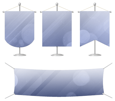
Key Points to Remember While Designing Banner for Printing
When designing a banner for printing, it’s important to focus on elements that ensure the banner is eye-catching, easy to read, and conveys the intended message effectively. R.J. Marx provides banner printing in Green Bay, Fond du Lac, Neenah, Oshkosh, WI, Appleton and surrounding areas.
- Font Selection
Readable Fonts: Choose fonts that are clear and legible from a distance. Sans-serif fonts like Arial, Helvetica, or Verdana are typically easier to read on banners than serif fonts.
Font Size: Ensure the font size is large enough to be read from a distance. A general guideline is 1 inch of letter height for every 10 feet of viewing distance.
Font Weight: Opt for bold or medium-weight fonts. Thin or very light fonts can be difficult to read, especially when printed on large-scale banners.
- Color Choices
High Contrast: Use high-contrast colors for text and background to make the text stand out. Dark text on a light background or light text on a dark background works well.
Color Psychology: Choose colors that align with the message or brand. For example, blue conveys trust, while red is associated with urgency or excitement.
CMYK vs. RGB: Ensure the design is created in CMYK color mode, which is used for printing. RGB colors are for digital screens and may not print accurately.
- Text Placement and Alignment
Hierarchy: Organize text with a clear hierarchy (headline, subheadings, body text) to guide the viewer’s eye.
Alignment: Centered text is easy to read on banners, but you can also use left or right alignment depending on the design layout.
- Visual Elements
Images and Graphics: Use high-resolution images (300 DPI or more) to avoid pixelation when printed. Graphics should be simple and relevant.
Logo Placement: Position logos in a prominent but balanced location, usually at the top or bottom corners.
- Material Considerations
Printing Material: The banner material (vinyl, fabric, etc.) affects color accuracy and durability. Choose a material that suits the environment where the banner will be displayed (indoor or outdoor).
- Bleed and Margins
Bleed Area: Include a bleed area (usually 1/8 inch or 3mm) around the edges to prevent white borders from appearing due to cutting discrepancies.
Safe Zone: Keep important text and images within a safe zone away from the edges to ensure they aren’t cut off.
- Simplicity
Less is More: Avoid clutter. Stick to a few key messages or points. Too much text or too many elements can overwhelm the viewer.
By keeping these points in mind, you will design a banner that is visually appealing, effective, and ready for print. Should you have any questions, feel free to give us a call.

